Matcha Filter for Photos
The soft matcha green on your own photo: pale soft highlights, a green-olive cast, a little haze. Nothing is redrawn and nothing is uploaded.
No photo? Try a sample
Presets in this editor
Matcha Latte
Loads automatically on this pageSoft matcha green: pale soft highlights, a green-olive cast, gentle haze, clean detail.
The exact values this preset sets, so you can rebuild or tweak it by hand:
iPhone 4
Soft edges, gentle grain, slightly warm 2010s smartphone vibe.
Grain 38 · Softness 32 · Vignette 18
Warm Digicam
Golden-hour point-and-shoot warmth with punchy colors.
Grain 28 · Softness 18 · Warmth 66
Cool CCD
Cleaner, slightly cool vintage sensor feel (subtle green/cyan lean).
Grain 22 · Softness 14 · Aberration 12
Flash Pop
Harsh highlights + glow like a built-in flash at night.
Bloom 20 · Grain 18 · Contrast 60
Soft Nostalgia
Dreamy, faded, warm — heavy softness + bloom for a nostalgic vibe.
Softness 48 · Grain 30 · Bloom 26
2000s Y2K
Warm, faded early-digicam color with soft grain and a gentle vignette.
Grain 30 · Fade 18 · Softness 16
Disposable Flash
Hard close-flash glow, warm grain, casual single-use snapshot energy.
Grain 26 · Bloom 24 · Softness 12
Huji-Style
Warm flashed glow with grain, made for the corner date stamp.
Grain 29 · Softness 14 · Bloom 14
Dazz-Style
Cool CCD glow with extra bloom and old-sensor color fringe.
Grain 22 · Bloom 14 · Aberration 13
Kodak Gold
Golden film warmth with soft skin tones and fine grain.
Grain 22 · Warmth 63 · Softness 12
35mm Film
Fine grain and restrained, true-to-life analog color.
Grain 25 · Softness 14 · Vignette 8
Film Grain
Fine, even film texture over otherwise natural color.
Grain 35 · Softness 10 · Fade 10
Lomo Punch
Dark toy-camera vignette with loud, punchy color.
Vignette 30 · Grain 23 · Saturation 62
Vintage Fade
Old-print warmth with lifted blacks and darkened corners.
Grain 28 · Fade 21 · Softness 20
Polaroid
Washed instant-film fade with gentle warmth and a soft glow.
Softness 22 · Fade 21 · Vignette 20
70s Print
Heavily faded amber print: washed-out blacks, low saturation, soft detail, dark corners.
Fade 30 · Grain 28 · Softness 26
80s Print
Faded drugstore-print colour: warm, pink-leaning, low contrast, soft grain.
Grain 32 · Fade 26 · Softness 24
90s Snapshot
Point-and-shoot flash, coarse film grain, punchy lab colour, neutral warmth.
Grain 34 · Bloom 18 · Softness 12
Frequently Asked Questions
The name now covers two different things. The viral one is, as the sites that copy it describe it, an AI repaint that makes the subject look made of green liquid. The older, quieter meaning is a colour look: soft, pale and green-leaning, the grade people put on cafe and matcha latte photos. This page does the second. The Matcha Latte preset regrades the photo you load and redraws nothing in it.
No. As the sites that copy it describe it, the trend that went round TikTok re-renders the picture as green liquid art. This page only changes its colour, so faces, clothes and backgrounds stay exactly as they were, and no AI runs here. If a soft green photo is what you were after, this is the closer match. If you want the liquid effect itself, that needs an AI image tool, which this site does not have on purpose.
Load a photo and the Matcha Latte preset applies on its own. The green comes from Tint, with a little Warmth so it reads as tea rather than mint. If the result is too yellow, take Warmth down towards neutral; if it looks flat, lift Contrast a little. Daylight photos of drinks, plants, flat lays and cafe rooms suit it best.
No. It is colour maths on the pixels you already have: a fixed set of sliders that lean the tint green, ease the contrast, add a little haze and glow. Nothing is generated and nothing is uploaded.
Not here. This site only adds a colour grade, and it never overwrites your file, so the original is still where you saved it. If the matcha effect on your photo was an AI repaint, a slider cannot undo it: that kind of effect rebuilds the picture rather than tinting it, and the tools that offer to remove it describe their results as approximations, not the original file. The reliable way back is the original photo, which is usually still in your camera roll or in the app you edited it in.
Drinks, flat lays, plants, cafe rooms and anything already soft and light. Portraits work too, but a green cast can turn skin sallow, so on a face ease Tint back a little (Tint needs WebGL, which almost every browser has). This editor has no crop tool, so frame the photo the way you want it before you load it.
Usually it is the light rather than the drink. Warm indoor bulbs push the whole frame yellow, and green mixed with yellow reads as olive or brown. Window light or a cool-white lamp keeps the green true. Set white balance in your phone’s camera app first if you can, then add the look; the grade is a matter of taste, not a correction.
No. Everything runs in your browser, so the photo never leaves your device, and there is no limit on how many you run through it.
About This Tool
“Matcha filter” now points at two different things. One is the effect that went round TikTok this year, which the sites copying it describe as an AI repaint that makes the subject look poured out of green liquid. The other is much older and much quieter: the soft, pale, green-leaning look people put on cafe photos, matcha lattes and flat lays. This page is the second one. It changes the colour of the photo you have and redraws nothing in it.
Load a photo and the Matcha Latte preset applies on its own. Its green comes from Tint, which this preset leans further than any other on the site, with a touch of Warmth so the green reads as tea rather than mint, a little haze from Fade and Softness, and a soft glow on the highlights from Bloom. The sections below show it on four kinds of photo, the colours it produces, and what to change when a result is not quite right.
What it cannot do is worth knowing before you start. It will not turn a person into liquid, and it cannot take a matcha filter off a photo that already has one: an AI repaint is not a tint, and no slider reverses it. There is a plain answer on that further down.
It runs entirely in your browser on phones and desktops, free, with no sign-up and no watermark. Export at up to 4096px on the longest edge, or resized for social.
Three things people mean by “matcha filter”
The phrase is being searched for three different jobs, and only one of them is a colour edit. Knowing which one you want saves the trip.
The soft matcha colour look
A grade: the photo leans green, the highlights go pale and soft, the contrast eases and a little haze settles in. It is the look people put on cafe photos and matcha lattes, and it is what the Matcha Latte preset above does to the photo you load.
The viral liquid-matcha effect
As the sites that copy it describe it, an AI image generator repaints the photo so the subject looks poured out of green liquid. That changes what is in the picture, which is the opposite of what this site does, and it needs a generator this site does not have on purpose.
Taking a matcha filter off
A tint can be undone by a slider. A repaint cannot, because it rebuilds the picture instead of laying colour over it, so the original pixels are not in that file. Tools that offer to remove it describe their results as approximations, not the original file. The dependable way back is the original photo, usually still in the camera roll or the app it was edited in.
If the repaint is what you are curious about, the guide on AI photo filters and real filters explains what it does to a photo, and the 80s photo filter page tells the same story for another AI trend, with a real colour look in place of it.
The same preset on four photos
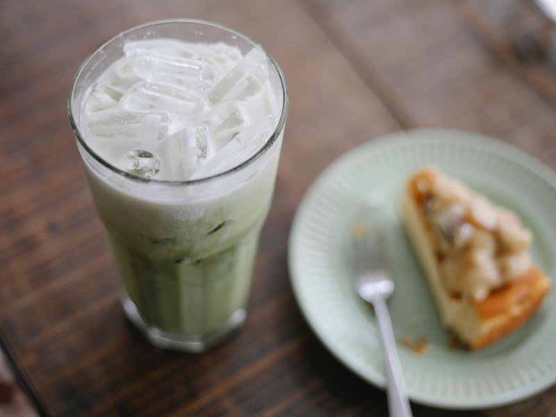
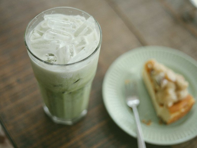
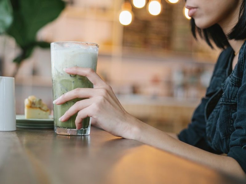
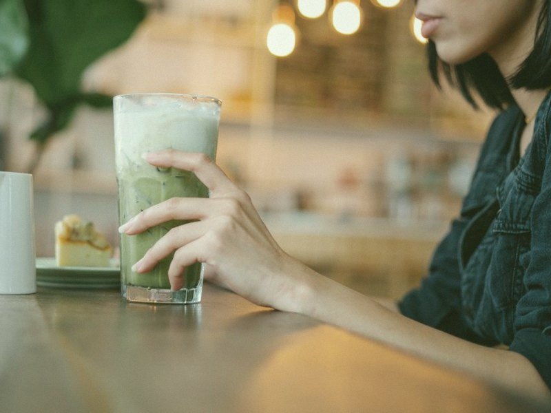
Nothing was adjusted between these: the Matcha Latte preset, straight from the editor, on four very different photos. Across the four, the share of pixels that land in the green hues goes, on average, from about 12% to about 40%.
 Original
 Matcha
Iced latte on a wooden table
The most forgiving kind of photo: something green in the frame anchors the grade. The pale green plate and the drink both pick up a little more green, and the red-brown wood turns a duller, yellower brown.
 Original
 Matcha
Cafe with warm bulbs
Warm light survives the grade: the glow on the counter stays amber, only a little yellower. What goes green is everything cool or neutral, like the denim sleeve. Skin drifts from orange towards a duller, yellower tan, which is the one thing to watch on a portrait.
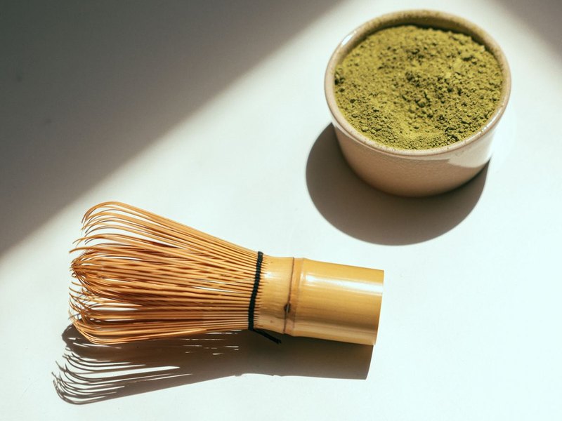 Original
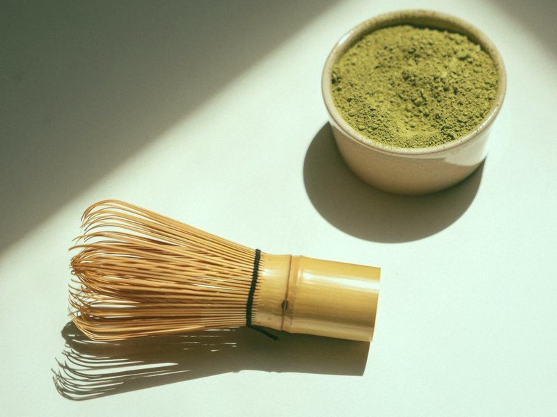 Matcha
Flat lay in hard sun
Neutrals swing furthest. The white table goes from a cold white to a faintly green one, while the golden whisk stays gold. Plain backgrounds show the cast most, so a flat lay on white is the quickest way to see what Tint is doing.
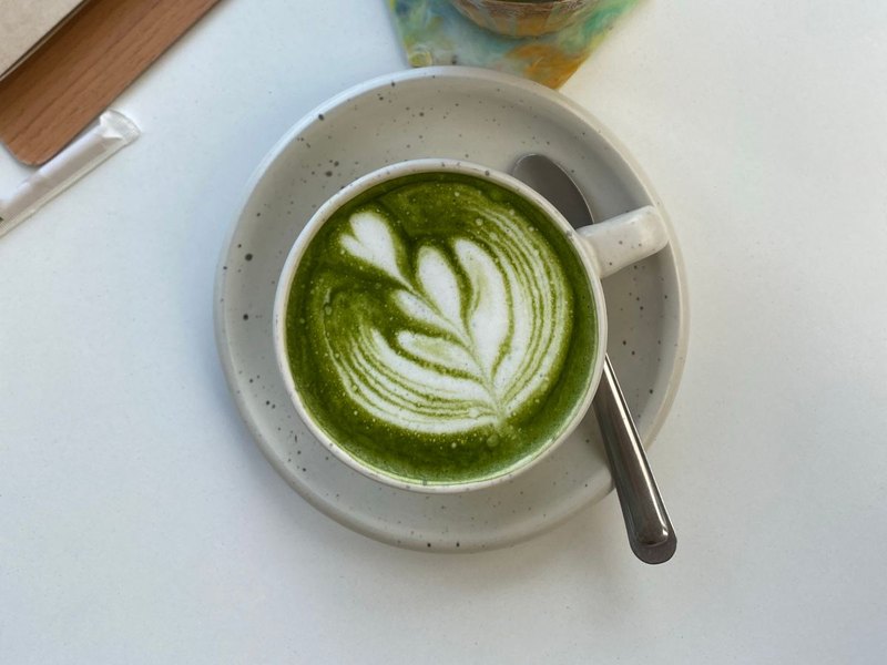 Original
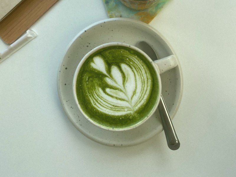 Matcha
Latte art from above
A vivid, saturated matcha barely moves; the grade leaves it green and lets the blue-grey saucer come round to meet it. The drink was already matcha, and the look makes the rest of the frame agree with it.
Sample photos from Pexels, free to use, cropped to 4:3: Charlotte May, Charlotte May, Cup of Couple, Tata N.. The filter is the only edit.
What moves and what stays put
The average colour of a small patch of each sample, before and after. The hue is the position on the colour wheel in degrees, where about 120 is a pure green. Cool and neutral things swing furthest towards it, warm browns and skin shift part of the way, and a golden whisk or a cup that is already green hardly moves.
| Where | Before → after | Hue |
|---|---|---|
| White table (flat lay) | 171° → 135° | |
| White saucer (latte art) | 203° → 139° | |
| Denim sleeve (cafe) | 185° → 109° | |
| Wooden table (iced latte) | 14° → 45° | |
| Skin, back of a hand (cafe) | 27° → 46° | |
| Bamboo whisk (flat lay) | 35° → 42° | |
| Matcha in a cup (latte art) | 72° → 76° |
The greens it makes
The green-hued pixels of the four samples above, averaged in five lightness bands, darkest to lightest. Handy if you want a caption, sticker or background that matches.
When it does not look right
Most misses are one of five things, and each has a single slider to reach for.
| You see | Usually | Try |
|---|---|---|
| Skin looks sallow or unwell | Too much green on a face. | Ease Tint back towards 60 to 65. Tint needs WebGL, which almost every browser has. |
| Mustard or yellow, not green | Warm indoor bulbs, or Warmth too high. | Take Warmth down towards neutral, but it is a gentle slider, so expect a small change. If the light in the original was yellow, fixing the white balance in your camera app first does far more. |
| Grey-green and lifeless | Contrast too low for the scene. | Lift Contrast towards 48. Fade is already low in this preset, so it is not the lever. |
| Acid or neon green | Saturation too high for the scene. | Take Saturation down towards 44. A vivid matcha does not need extra colour. |
| A white background you wanted to stay white | The look greens neutrals by design. | This is what Tint does. For a product shot that must stay clean, ease Tint back (it needs WebGL, which almost every browser has) or pick a different look. |
Other soft looks nearby
If what you want is warmth rather than green, the Huji-style filter gives a film-print glow, and the digital camera filter has a dreamier, softer preset. For something that reads as an old print, try the vintage camera filter. Once the colour is right, the vignette tool can pull the eye to the drink, and every look is listed on the filters page.
See the difference
How to get the matcha look
- 1
Load a photo in daylight
A drink, a flat lay, a plant or a cafe corner lit by a window works best. It stays in your browser.
- 2
Start from Matcha Latte
The preset applies on its own: a green lean, gentle warmth, lowered contrast, a little haze and a soft glow on the highlights.
- 3
Tune the green, then export
Warmth decides how yellow the green goes and Saturation how strong it is. Then download.
A matcha recipe
Building it by hand? These six sliders behave the same on every device. The green itself comes from Tint, and the haze and glow from Softness and Bloom; those three need WebGL, which almost every browser has. On the rare fallback renderer you get the warmth, softer contrast, fade and colour, but not the green.
Matcha vs the other soft looks
Matcha is the look here built around a green hue rather than an age or a camera. Its Tint sits at 80 where no other preset goes above 55, and it carries the lightest grain on the site, tied with Flash Pop and Polaroid, and only a faint vignette. Polaroid is the closest match on every other slider, with the same grain and softness, but it is a washed instant print rather than green. Soft Nostalgia is softer and warmer, and Huji is punchier and built around a corner date. If the photo needs to look old, not green, start from Vintage Fade.
AI photo filters vs real filters
The matcha trend, as the sites copying it describe it, is an AI repaint. What that changes about the photo, and why a real filter leaves it alone.
Try another look
Not after a whole look? You can also drain the colour out instead or darken just the corners. The rest are on the tool list.