Best retro filter settings for portraits, street, and night
A practical, slider-by-slider cheat sheet for the situations where retro filters either shine or fall apart.
By Skyz, maker of DigicamFilter · Updated October 4, 2026
A retro filter that looks great on a sunny street photo can wreck a portrait, and a setting that nails a night shot can turn daylight muddy. The fix is to adjust by situation. Here is what to do for the three most common ones, plus a quick guide to what each slider actually does.
What the sliders do
- •Grain: adds texture. A little stops a photo looking too clean; too much looks noisy.
- •Softness: relaxes sharp edges. Too much can hide facial or scene detail.
- •Bloom: makes bright areas glow. The core of flash and CCD looks.
- •Fade: lifts the blacks for a washed, nostalgic finish.
- •Warmth: shifts color toward yellow-gold (up) or cool blue (down).
- •Vignette: darkens the corners to draw the eye inward.
- •Aberration: a faint color fringe at edges that reads as old optics.
Portraits
Start with detail you want to keep: eyes, hair and the natural differences between skin tones. Try a low overall strength before changing individual controls. If warmth turns skin orange, move Warmth toward 50; if texture hides facial detail, reduce Grain and Softness. A filter does not need to smooth skin to feel nostalgic.
Portrait starting point
Optional ranges to explore at reduced strength, not the exact settings used in the comparisons below.
Street and daylight
Daylight gives you more detail to compare. Choose your color direction first: cool for a CCD-inspired grade or warm and faded for a 2000s look. Check faces and white objects before adding contrast or grain; a brighter source does not make heavy texture right for every photo.
Street / daylight starting point
Night and indoor
Check the source lighting first. On a photo already taken with direct flash, a little bloom can spread the bright areas; pushing it too far can blur white clothing and faces together. On an unlit photo, this editor cannot add real flash lighting or recover detail that was never captured. Compare at lower strength before increasing glow.
Night / indoor starting point
Keep the first pass gentle if the source already has flash. These optional ranges are not the exact recipe below.
Golden hour
Late sun already provides warmth, so begin gently. Kodak Gold or Warm Digicam can be useful starting points, but neither is automatically best for every shot. If skin or clouds turn too yellow, lower Warmth or Filter strength rather than adding more color.
Golden hour starting point
Overcast and flat light
Gray days produce flat, low-contrast photos that most filters make muddier. Counter it: raise contrast a little instead of lowering it, keep fade minimal, and lean cool rather than warm. The CCD treatment suits overcast light because its punchy, cooler color adds the definition the sky took away.
Overcast starting point
Which preset fits which situation
Every preset in the editor can be tuned toward any of these recipes, but each one starts closest to a particular situation:
| Situation | Start from | Then adjust |
|---|---|---|
| Portraits | iPhone 4 or Kodak Gold | Lower grain, lift shadows |
| Street / daylight | Cool CCD or 35mm Film | Contrast up, pick a color direction |
| Night / indoor | Disposable Flash or Huji-Style | Bloom and highlights to taste |
| Golden hour | Kodak Gold or Warm Digicam | A touch more bloom |
| Overcast | Cool CCD or Dazz-Style | Contrast up, fade near zero |
| Quiet, timeless scenes | 35mm Film or Polaroid | Restraint; grain only |
When in doubt, add less than you think. Retro looks read best when they feel like a property of the photo, not a layer on top of it. You can always push a slider further; it is harder to notice you have gone too far.
Try these settings on your own photo. Use Compare to check facial detail, then download. Photo processing stays on your device.
Keep a look you want to use again
- 1Choose a starting preset, then adjust Filter strength before adding texture. The examples below offer exact settings at 45% and 100%.
- 2Open My saved looks to name the colors, strength, textures and frame on this device. Photos, dates and crop positions are not stored.
- 3Use Share this look to make a settings-only link. The recipient chooses their own photo; the link does not contain your picture, date stamp, crop or saved-look name.
- 4For a series, check a second photo before using Batch filter. A batch keeps settings consistent, not lighting: one recipe will not correct every source photo automatically.
Choose settings for the photo you have
Compare the same source at 45% and 100% strength. These are generated example photos, not real-camera calibration or a skin-tone accuracy test. The edited versions were rendered with this editor; faces and framing are unchanged.
Daylight portrait
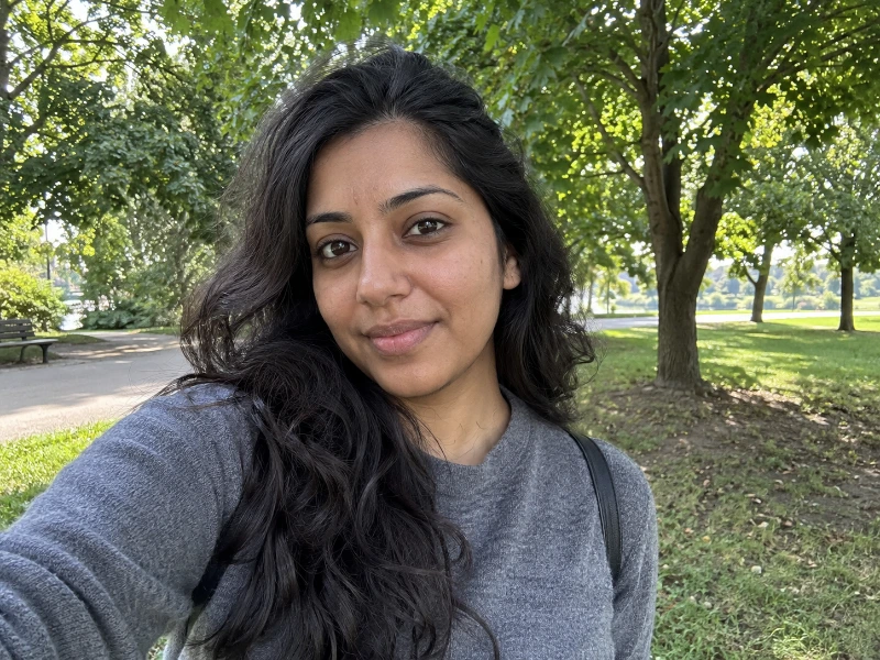
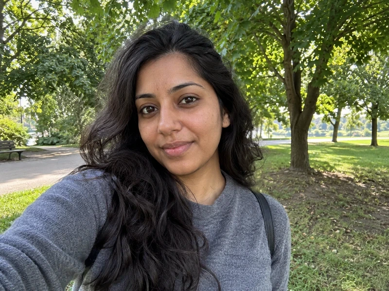
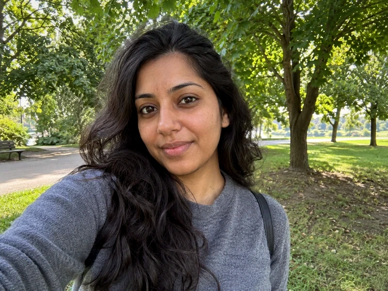
Start at 45% strength. Check the face before the background: if skin looks too orange, lower Warmth toward 50 before adding grain.
When to back off: More strength also means more warmth and texture. If skin loses detail, reduce strength or Softness; a faded look is not a reason to wash out a face.
Exact settings for this comparison
- grain
- 16
- softness
- 16
- contrast
- 54
- saturation
- 58
- warmth
- 56
- tint
- 50
- highlights
- 48
- shadows
- 52
- vignette
- 12
- aberration
- 8
- fade
- 8
- bloom
- 6
Only strength changes between the two grades. Original crop; textures, frame and date stamp off. In compatibility mode, unsupported controls are disabled and the result can differ.
Direct-flash night photo
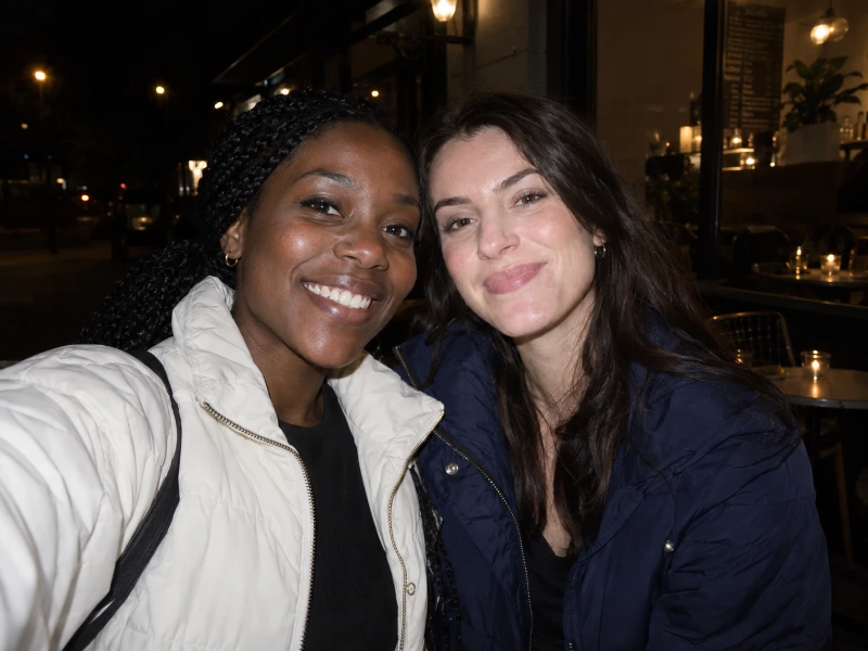
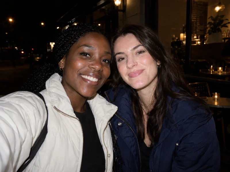
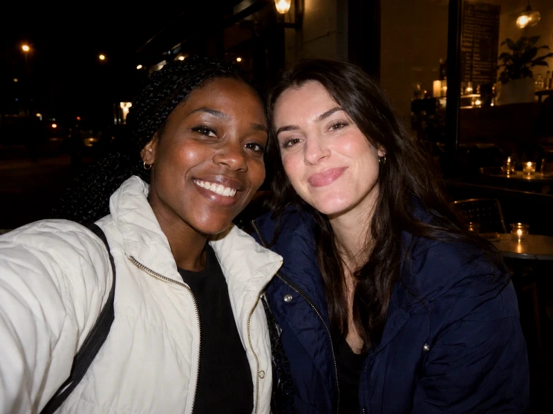
The source already has flash lighting. Check the white jacket and face highlights; keep Bloom low when lights already glow.
When to back off: A stronger grade cannot add a flash to an unlit scene or recover clipped highlights. Lower strength if the jacket or faces lose separation.
Exact settings for this comparison
- grain
- 18
- softness
- 10
- contrast
- 54
- saturation
- 58
- warmth
- 54
- tint
- 50
- highlights
- 46
- shadows
- 52
- vignette
- 12
- aberration
- 8
- fade
- 4
- bloom
- 8
Only strength changes between the two grades. Original crop; textures, frame and date stamp off. In compatibility mode, unsupported controls are disabled and the result can differ.
Friends in daylight



Judge every face, not just the brightest one. Keep the original crop and start at 45%; use the same settings for a small batch after checking each image.
When to back off: One setting may suit one face but not another. If darker faces lose detail or lighter ones look flat, back off contrast and strength rather than adding more fade.
Exact settings for this comparison
- grain
- 16
- softness
- 10
- contrast
- 50
- saturation
- 58
- warmth
- 54
- tint
- 50
- highlights
- 48
- shadows
- 52
- vignette
- 12
- aberration
- 8
- fade
- 8
- bloom
- 4
Only strength changes between the two grades. Original crop; textures, frame and date stamp off. In compatibility mode, unsupported controls are disabled and the result can differ.
For a more faded Y2K starting point, compare the other camera look.
Frequently Asked Questions
Start from a reasonably exposed photo, apply the look, then make small adjustments. The filter is doing tonal and color work, so a wildly over- or under-exposed starting photo will fight it.
The full-size option retains the working resolution, capped at a 4096px long edge; the editor never upscales. Frames count toward that cap. For smaller social posts, try 1080px on the long edge and check that facial detail and grain still look right.
No, and that is why every value here is a range. Light, skin tones, and how busy the frame is all change how far a slider can go. Start at the low end of each range and push until it stops improving.